I’ve been waiting for quite awhile to do this update. I was waiting on a promised change from the developer of the suite of controls I’m using to build StoryBox. It will hopefully fix quite a few outstanding issues, and perhaps should be faster (they keep talking about speed improvements).
They finally released the latest version earlier this month, and one thing I found is that the themes I’d been using had changed. I didn’t like them at all, especially the black, which had even less “black” in it that the current black theme.
The next update is all about integrating these controls and making the themes look the way I want them. There will be changes to every theme. It’s unavoidable. I hope you like the new ones better.
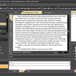
Here’s an early look at the “New Black”


Has a sci-fi kind of look to it. I’m thinking the reason they put more of a grey tone to it is to make it easier on the eyes. Comparing that picture to the current version, the new black seems to have less of a glare for my tired old eyes. 🙂
Maybe it’ll be a good thing.
Well, what you see in the screen shot is the result of my spending about eleven hours removing all of the “white” and “light gray” that was in the default black theme. It had even more glare than my original black theme.
Now, I just have to spend about 10 hours each on the other three themes.